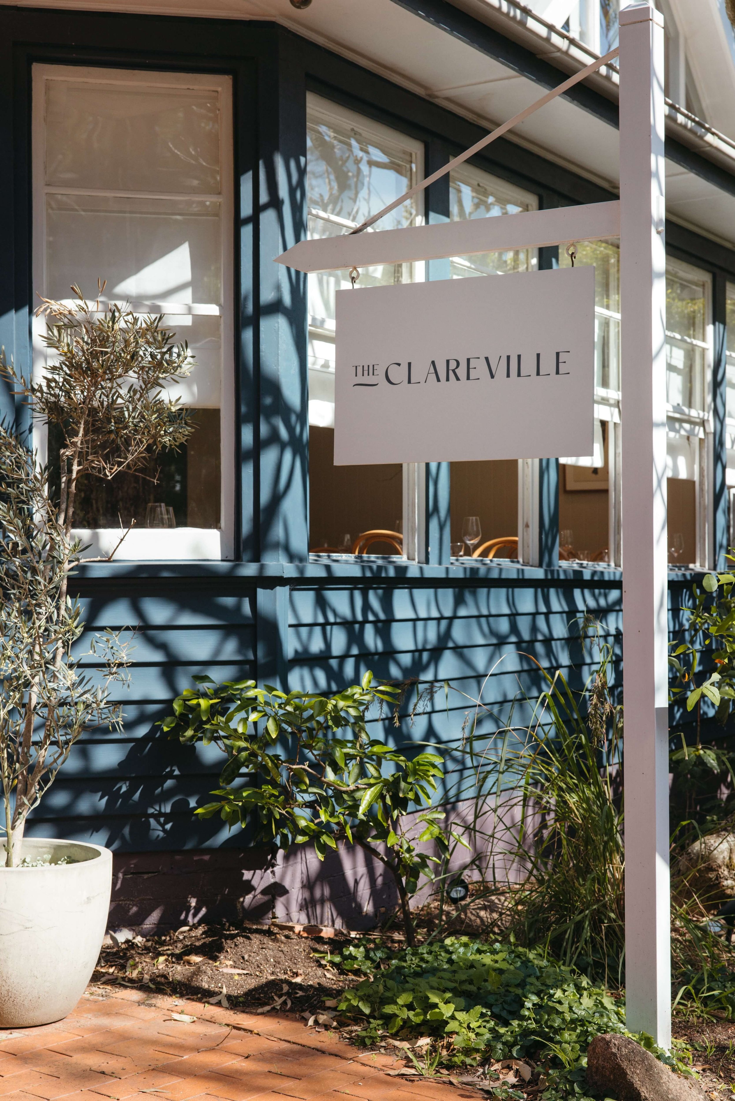
THE CLAREVILLE
Nestled in a heritage-listed cottage just steps from the shoreline, The Clareville welcomes the breeze and invites you in…
At the helm is chef-owner Cooper Dickson, whose experience spans far off places to breathe new life into the old weatherboard - originally a 1960s post office and general store. The branding palette draws from the building’s existing materials and colours, creating a seamless transition between space and identity that surrounds patrons in a cohesive, immersive experience.
Branding, Materials, Signage, Stationery, Website
Chosen Concept: With over 40 years of dining history, it was important that the refreshed identity pay homage to the original blue-teal facade, staying true to the classic heritage palette. A hand-illustrated graphic of the cottage and simple typographic logo with a subtle nod to the shoreline anchors the brand, carried through in refined fonts and graphic assets creating a cohesive and timeless suite.
Image Credits - Client


